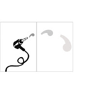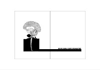


 These are the layouts of the images, there will be minimal amounts of text making comments on design as an ecosysytem, also subversive messages about aspects of the environment that are pressing issues. I deliberately kept the colours basic and stark in keeping with the kind of style i want the book to take on.
 APOLOGIES FOR THE DODGY SIZE ISSUES-NO IDEA WHY THATS HAPPENED??
4 comments:
These are so delicate, Rachel they're truly beautiful. I like the minimalistic approach of the layouts, text and images too and the cropping looks great. Its nice way of approaching the issue, well done!x
yup yup, agreeing with mary all the way!!!! Rachel these are lovely!!! and so thoughtful. i just want to look at the owl for hours and hours, and the brain is 'chapeau' (meaning I take my hat off for you!!). Keep it up! I reaaaaally look forward to seeing it all, you should go into selling the book, you really could!! Near carnaby theres a shop that I'm sure would be interested. The only reservation I have is that though I really like it, seeing whats inside I feel the cover lacks its greatness, the type chosen for the text is good but the rest lacks the feeling of what your going to get once you open up (maybe thats the point of it...). But anyways well done, you fought for this one and you should be proud!!
Hi Rachel
ditto to the comments above. I think this is a really insightful piece of work tackling a subject that not many know how to, so so well. I can also see this in one of those illustration books in magma. its a book i would want to keep! I do agree with Carla, its the first thing I though as well. the book might get lost as the cover doesn't echo the lovely illustrations. Id like to see a small teaser of pattern bleeding onto the back, just a taste of whats inside. very well done.
Aimeex
my mistake on the owl..... is it a robin?
Post a Comment